Renewable Energy for the Future
Project Green Energy focuses on eco-friendly planning and consultation in the greater Wisconsin area. Starting with a solar consultation, their goal is to quickly expand to other zero-emission and carbon-neutral planning and implementation.
The Process
Step 1.
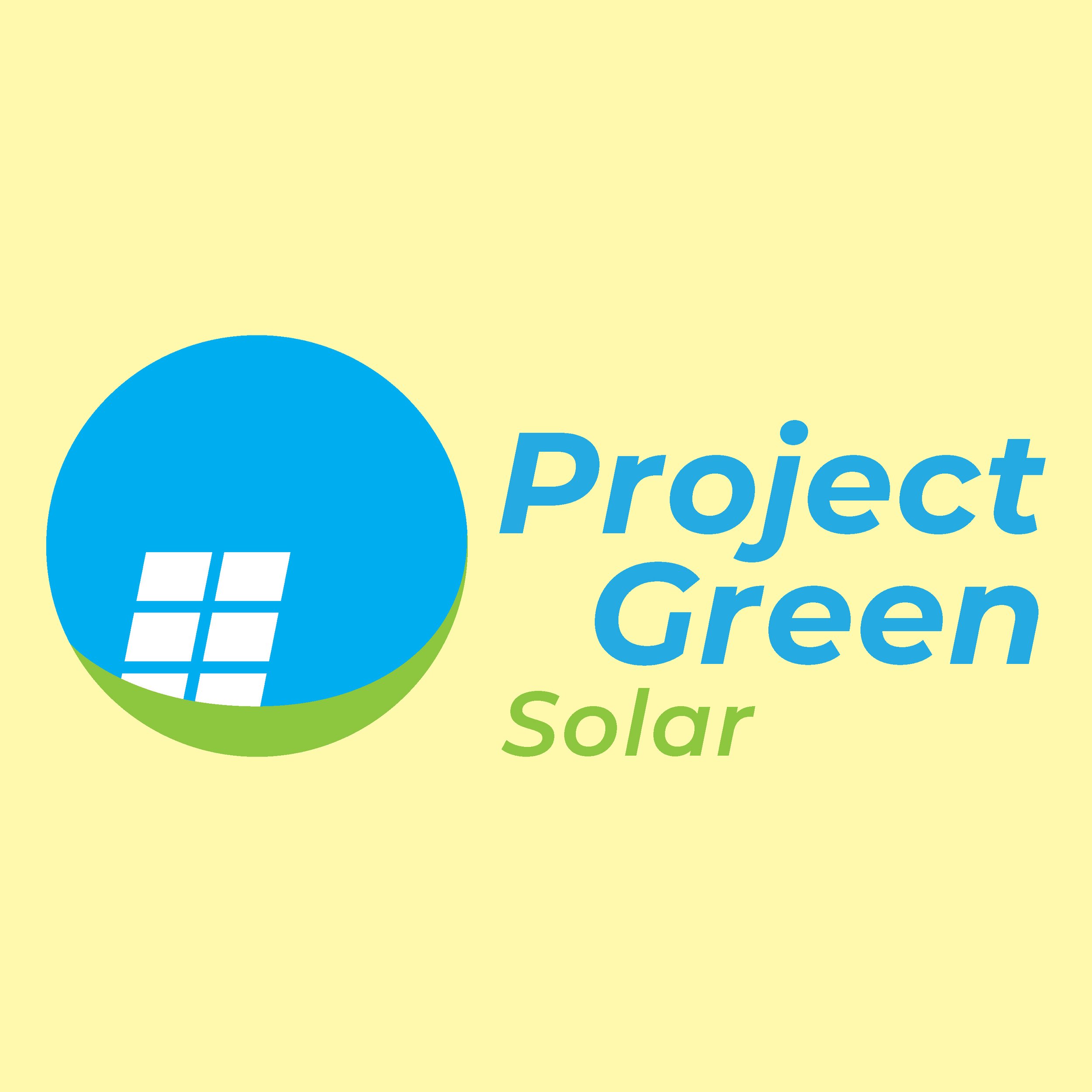
Based on client brief and review of sample imagery, I created 3 abstract marks focusing on featuring a recognizable and scalable icon with a strong font to support.
Their goal was to embody a playful but corporate image using the icon as the primary branding.
Step 2.
After reviewing the first drafts, the client adjusted their brief to switch to a simplified modern workmark instead of including an icon.
Another adjustment was moving away from solar in the branding, as they will focus on many types of eco-friendly consultation down the line.
Based on that feedback I created a wordmark using the modern sans-serif font the client preferred from the first drafts, and included a couple of colorways and layouts.
Final Mock-ups
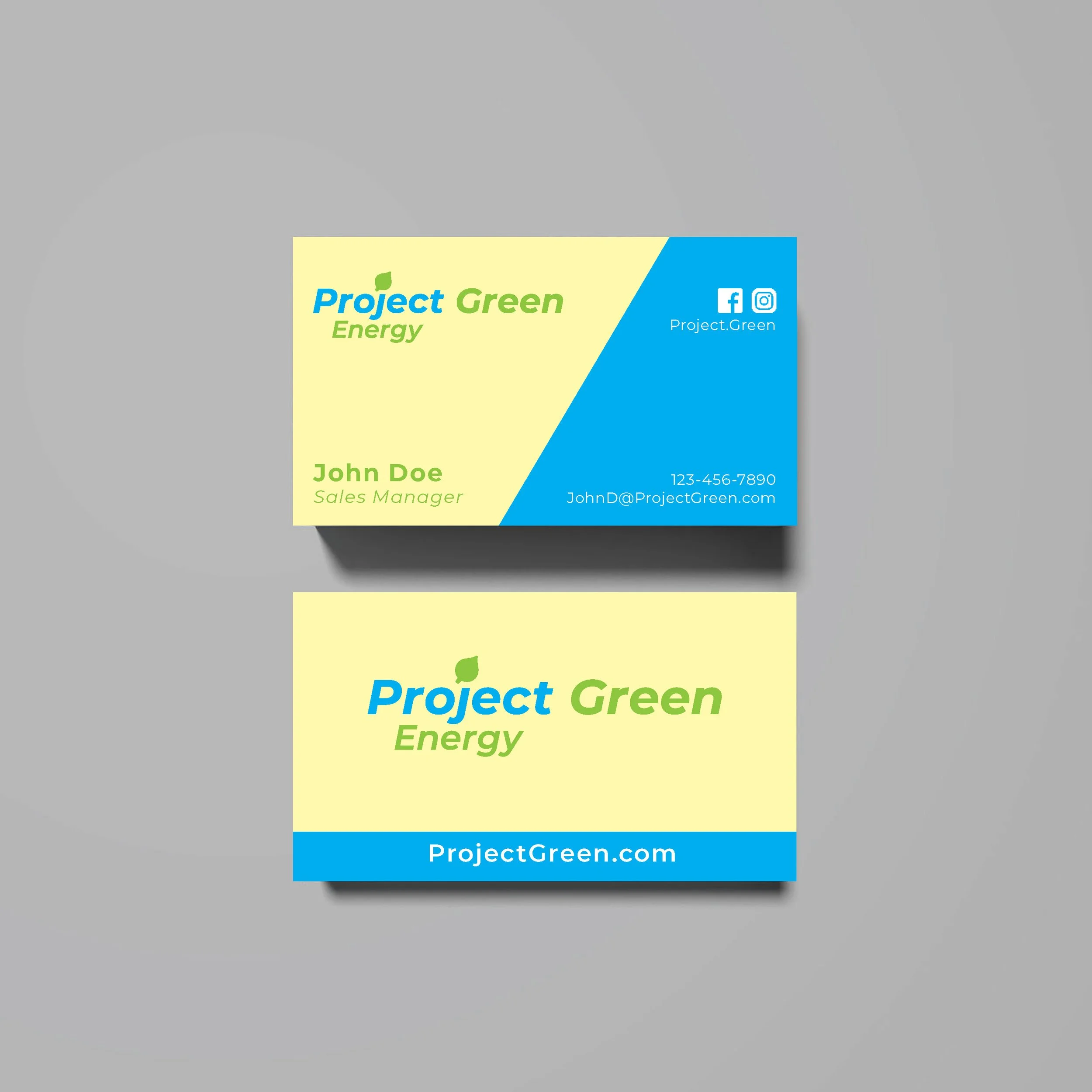
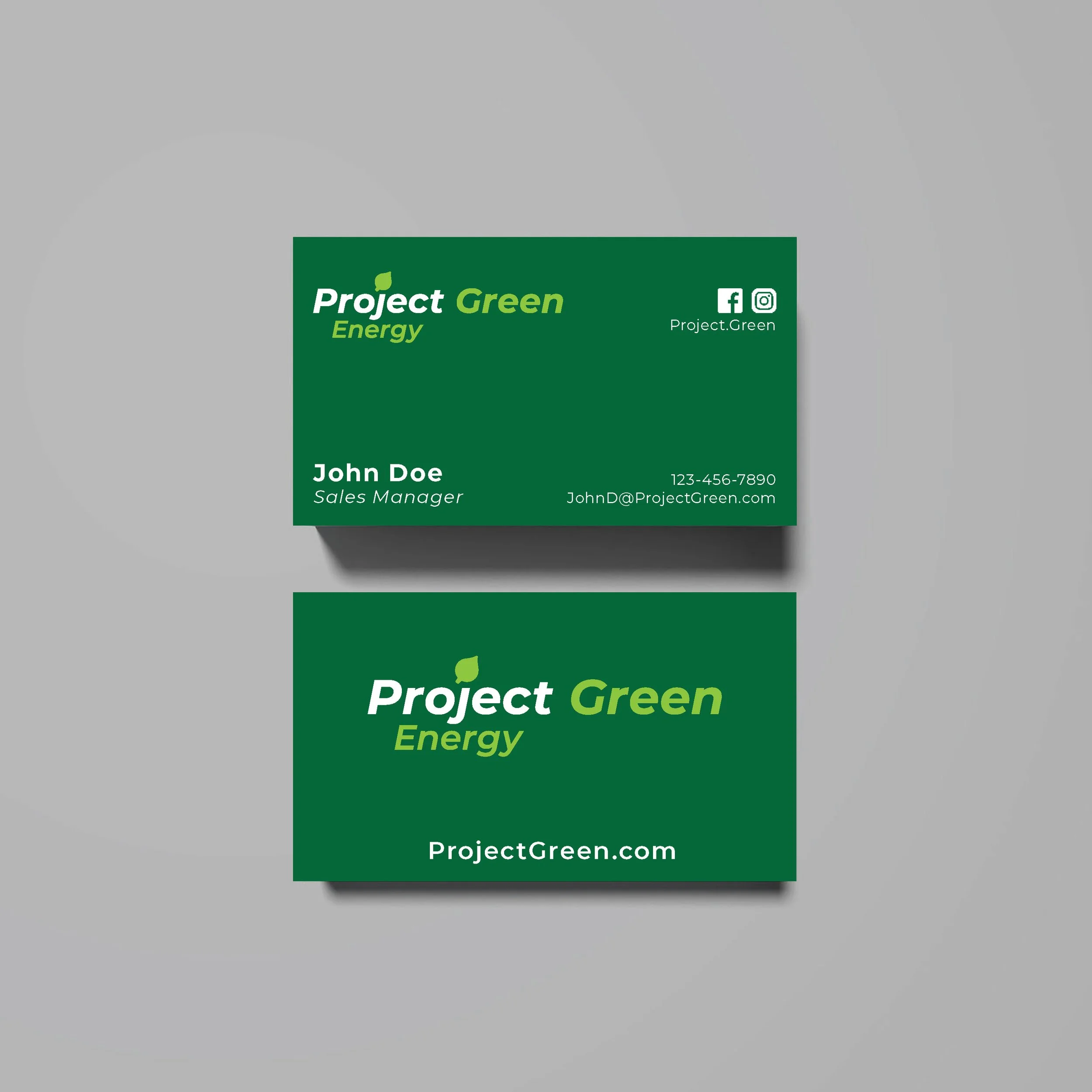
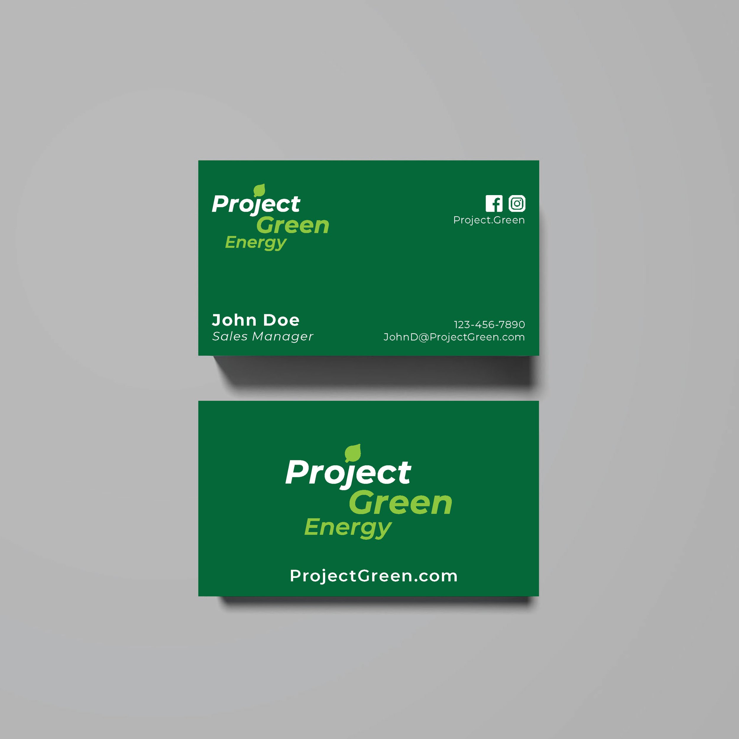
Once the client reviewed and approved the simplified wordmark, I worked up a final mock-up of what it would look like used on a branded item like business cards.
